Copywriter Websites: 5 Great Examples to Learn From
One of the most common questions new copywriters have is how to put together a website, including the all-important copywriting portfolio. My advice? Look at other copywriter websites for inspiration, which is exactly what we’re going to do in this blog post.
Below, I’m including screenshots from five different copywriter websites. I’m not affiliated with them, and I don’t know them, either. I think these sites are well done, for various reasons, which I’ll get into. See what you think! I’m also embedding a video at the end from my YouTube channel where I walk through the sites in real time.
Copywriter Websites: Salted Pages
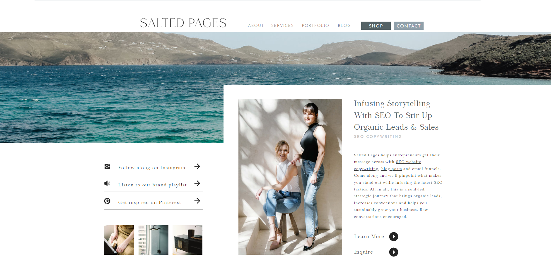
I love the feel of the site, which reflects the fun name “Salted Pages.” The headline clearly explains what these women do: “Infusing Storytelling with SEO to Stir Up Organic Leads &Sales.” The whole site feels like a breath of fresh sea air. The copy reflects the sea theme, too. (Packages include Low Tide, Sea Level, and High Tide, for example.) They list prices for copywriting packages, which is interesting. I’d be curious to know how well that works for them.
There are pros and cons to including pricing. The pro: It helps someone self-identify whether they have the budget. The con: You could potentially lose someone who has the budget, but doesn’t understand the value of copywriting—yet. Sometimes you need to have a few discussions with prospects to get them to understand. Then, they might be more willing to accept a quote that they might have otherwise found “pricy.”
Copywriter Websites: Kat Boogaard
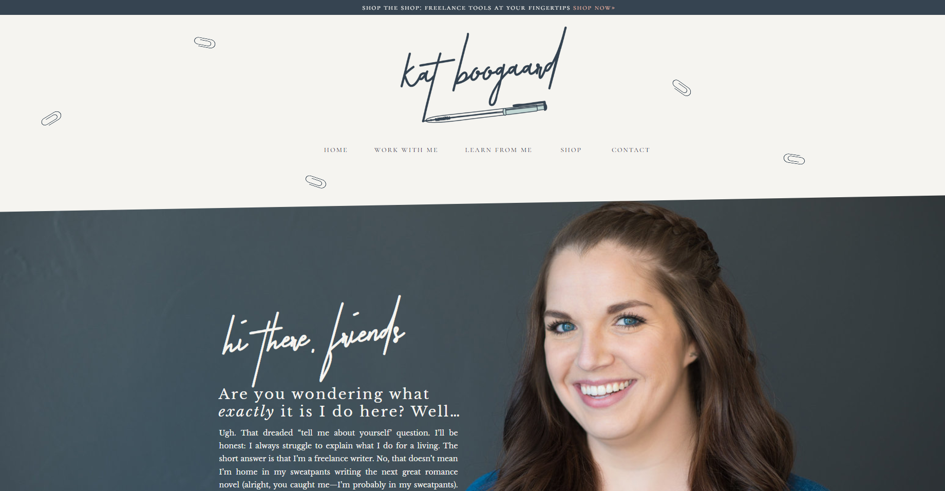
Kat is well-known in the copywriting space. She does a lot to help new copywriters thrive. Her website captures her professional work and the work she does on behalf of new writers. The navigation clearly indicates where people need to go if they want to work with her—or learn from her. The writing itself is excellent . . . conversational, friendly, and warm. You truly get a sense of what it would be like to work with her and the writing she’d produce for you.
Copywriter Websites: Amanda Born
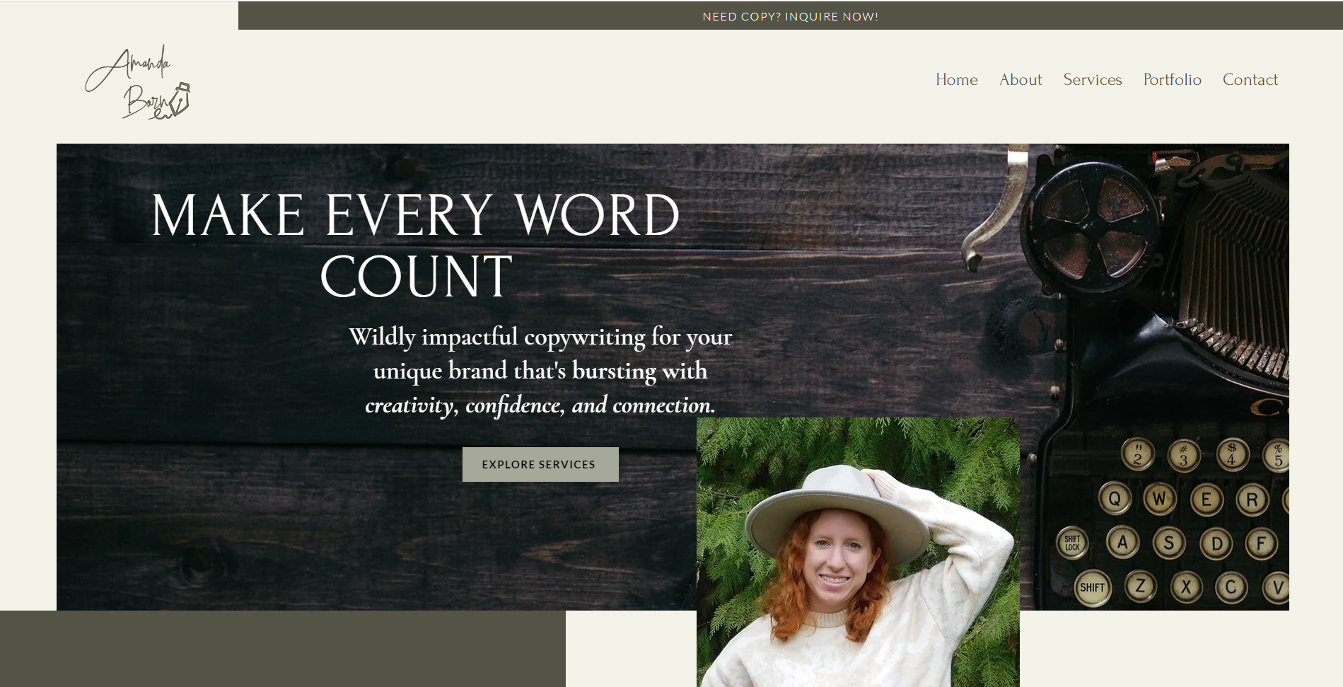
I love the flow of this site—it’s smooth and aesthetically pleasing. It’s not overly complicated. Her contact form is good (so if you’ve been wondering how to address this on your own site, Amanda’s is a good one to study).
I *think* Amanda is a newer copywriter, which is one of the other reasons I’m including her site as an example because it shows how you can have a great site even when you’re just starting out. (I’m gleaning this from her Insta page for her copywriting biz, which looks like she started in January of 2022; also she uses a bunch of spec ad examples in her portfolio, which is absolutely OK. When you’re starting out, you can use copy that you write “on spec” for a brand or fictional company to demonstrate your copywriting chops.)
Copywriter Websites: Kevin Hill
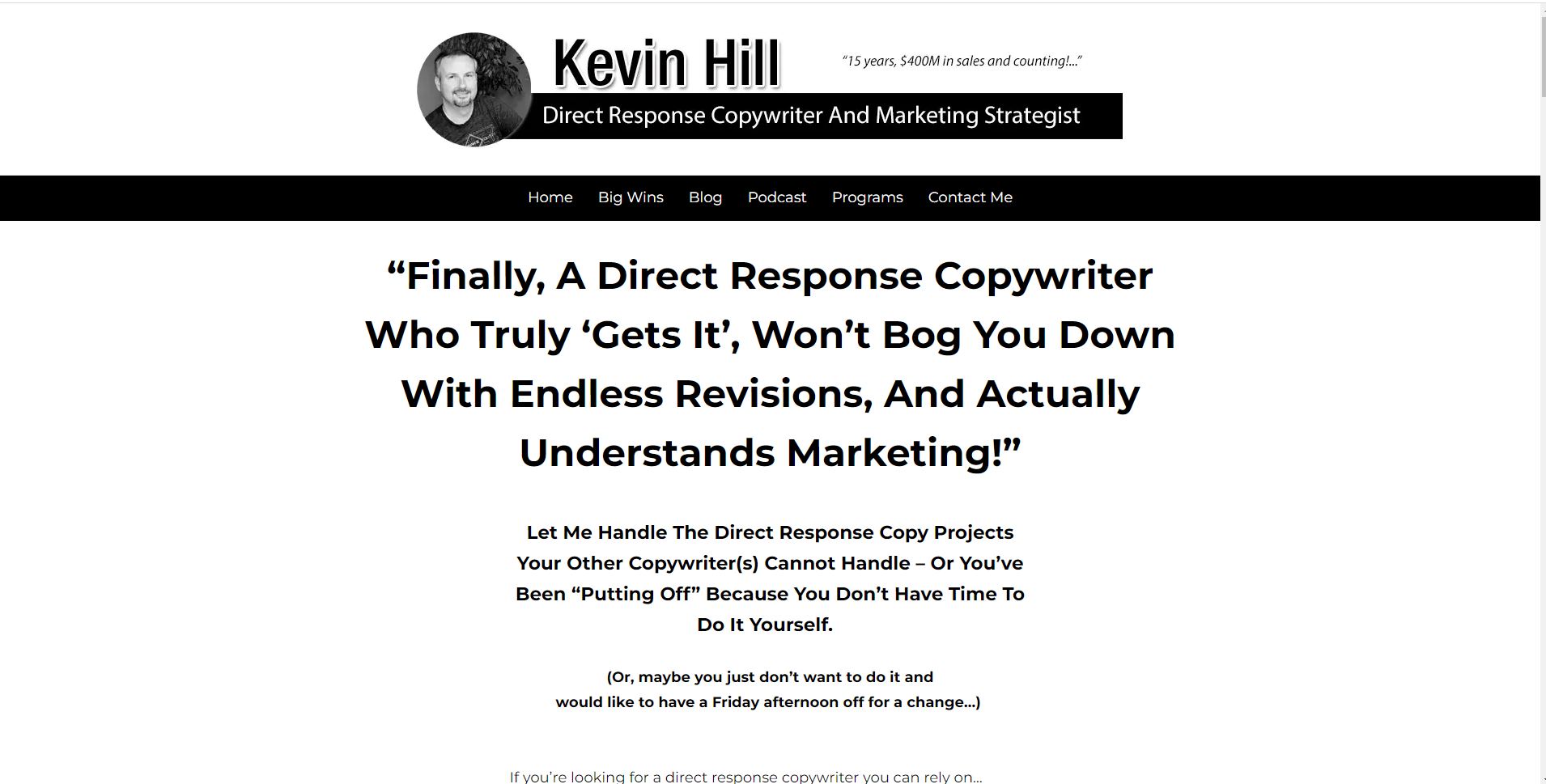
Kevin is a direct response copywriter, and what I LOVE about his site’s home page is that it’s written in the format that copywriters use for direct response—so he demonstrates his ability for this copywriting service right on his own home page.
Direct response copywriting in a nutshell—it’s a type of longer-form copywriting that takes advantage of people’s willingness to scroll if the info is good, with the goal of getting them to ACT NOW. This type of writing is usually very persuasive, starting with the problem the prospect is having and then walking through a solution, social proof, the “deal” that people will get if they choose this solution, compelling calls-to-action peppered throughout, etc. And it’s not just for digital. You’ll find direct-response copywriting techniques used in sales letters. (Have you ever gotten a long sales letter in the mail? I’m talking multi-pages? That’s direct response copywriting at work. Oftentimes, copywriters will earn royalties.)
Anyhow, Kevin’s home page does a brilliant job of showing people he knows exactly how to write engaging long-form copy.
Copywriter Websites: Charlotte Wilkes
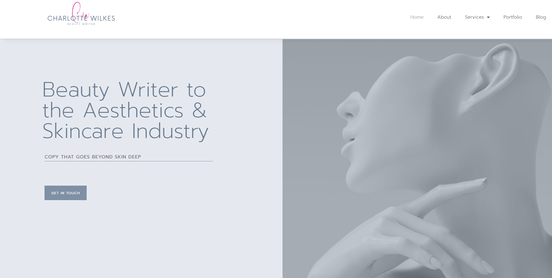
Charlotte is a specific type of copywriter—she writes for the skincare market—and her site makes this immediately clear while reinforcing her own brand. It’s a lovely site, and I imagine it would be extremely appealing and persuasive to a beauty brand looking for a beauty copywriter.
Here’s the video where I walk through the sites.
Definitely watch since I poke around the writers’ copywriting portfolios, too!
Got a Question for the Copy Bitch?
That’s me! I’m the Copy Bitch. Contact me or visit my YouTube channel and leave a comment on one of my videos. I might make a blog post or video with the answer.
